![]()
![]()
More about this site
The website was born around 2005 and was in preparation for some years.
The incentive to start creating the site came from many people and sources. The official Jascha Heifetz website did provide a presence on the net and also served the corporate business. My aim on the other hand, was to provide a place for the true music lover, devoid of any commercial involvement, where fans could visit and celebrate Heifetz's life and achievements. Preliminary talks with the Heifetz family did indicate an initial willingness for such a site to emerge.
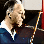
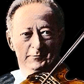
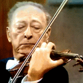
Along with the site's non-commercial nature, it's primary aim and priority is to offer information. Much already exists on the web, scattered around a large number of websites: photos, movies, biographical data - alas, some of it erroneous. Amusingly, some Heifetz photos on websites that should have known better, are mirror-flipped, such that Heifetz becomes a left-handed violinist. If one has the time and patience to browse all these source and gather all the available information, perhaps s/he can fathom a rough picture of the artist. In the pages of this website I have gathered much of my information into one place and added of course much material previously unavailable elsewhere. Having collected information for some 40 years on Heifetz, initially for his biography, much of it has now found its way on this site.
In terms of presentation, I have always liked websites which are simple (at least visually), accessible and easy to navigate. To that end I decided to make the menu available on almost every page, such that one is able to navigate from and to almost any location within the site. People browse sites differently, and their interest in specific subjects vary. I hope that the ability to click the particular page of interest will increase the browsing experience. However, a more methodical and in depth browsing will reveal of course further layers of information. A small number of pages dictated a sequential design and some extra large images and articles required owning the entire page. Nevertheless, they are never further than a click away from the main menu.
The Heifetz logo, as it appears on the pages here - the contact link - was a way back attempt of mine to design a book jacked for my Jascha Heifetz biography. (Robert Hale, London, 1986, Schirmer, New York,1987). At the time it had managed to pass all editorial stages but ultimately I couldn't quite make it past my editor-in-chief. An early photo of the violinist was used instead for the book jacket and the logo had to be shelved. Just as well perhaps, for it comes in handy for the design of this website and I think that it is finally put to good use.
I have tried to keep pages' loading time as low as possible. This is a rich media site. I have opted for the quasi-streaming approach to music and video. Thus, once a soundtrack or video is selected, it starts almost instantaneously, depending on the visitor's bandwidth. Some soundtracks were re-equalized by me, or else processed for cleaner sound. Those who like the samples are encouraged to acquire the Heifetz Collection from the usual outlets - an astounding compilation of an unequalled performer.
I am told that the visual appearance of the site is somewhat misleading, belying the rich content and coding engine lurching below a largely black page. Well, may be. But if true, it will only be keeping in character with the general, and misleading, Heifetz aura. After all, wasn't he frequently criticized for that deceptive, poised stage posture, which belied the white fire and passion underneath? So don't be fooled by appearances - the methodical and patient visitor will be rewarded, I believe, with much information and a lot of visual/graphical material. Heifetz fans will probably need no persuading, but the more casual visitor is indeed encouraged to spend some time here.
Other tricks-of-the-trade techniques were also kept low and, as always, the basic page layout is a compromise. Among other factors, the target screens on which it will display is considered. The site was tested on all major browsers and at several resolutions. In order to make the browsing experience easier and more enjoyable, I decided to make most pages self-contained within one full screen, without necessitating horizontal (sideways) scrolling. The minimum screen resolution aimed for is 1280x768. Lower resolutions will have to scroll a bit, but those screens are fast disappearing, if they have not done so already.
That's about it. The website is by no means finished - it is a work in progress. I am aware that there is still much that can, and needs, to be added. So If you wish to contribute, add, suggest, please email me. If you find the site useful, please leave your feedback.
Enjoy.![]()

